

In my current and past experiences, I’ve seen a ton of data and how people look at “what is good” and the common pitfalls people make. As much as people like “good looking” numbers, it’s important to make sure you’re making decisions on the right data.
In most scenarios, they all fall ill due to the following problems:
1. They focus on the wrong metrics
2. They have bad data (or no data)
3. They don’t analyze at varying timelines (including trends/seasonality)
4. They don’t break-down engagement
Example 1: Poor Focus
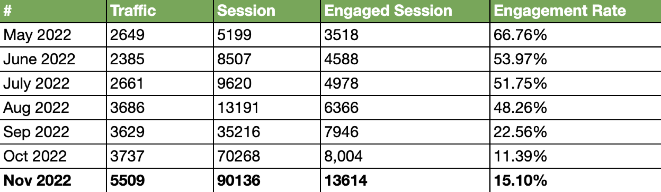
A perfect example of this (won’t disclose where this came from), I saw a post with the comment, “traffic is moving upward”:
If we plot this data a little bit differently, it is clear there is a problem:

Now, if you look at the top line quantity numbers they look great, however, if you look at the engagement rates they look horrible. What does this mean? The cohorts you’re targeting are the wrong ones, or your “offers” aren’t appealing to them. Meaning that you’re broadcasting your site to a great populous, however, the content or site isn’t appealing to them and hence they aren’t engaging. A good way to think of a website, is every piece that is actionable is like an ad or offer, what you present to the viewer needs to be appealing to get them to “bite.”
From May to November the number of sessions went from 5,199 to 90,136 which is a growth rate of 16.3x! However, if you look at the growth rate of engaged sessions they went from 3,518 to 13,614 for the same period, or a growth rate of 2.86x. The difference between 16.3x and 2.86x is very large and needs to be addressed.
Anytime you expand outreach you’re likely going to see a decrease in conversion rates, as you’re moving from a very targeted crowd who is the ideal candidate to potentially expanding to some who may or may not be interested, however this should not be
The key here is tracking the changes in these conversion rates and adjusting them. If conversion rates drop significantly, your targeting, offers or approach is flawed. If they don’t change significantly, keep it up.
This also applies to many things outside of digital traffic, including things like lead to opportunities, etc.
In general, top line quantity metrics don’t mean sh!t if your conversion or engagement rates drop!
Example 2: Bad Data
I’ve been working with Google Analytics for a decent amount of time and am always cautious about data quality. In this scenario, we will highlight the importance of a few core points:
- Look at different periods
- Look for anomalies
- Always question data sanity
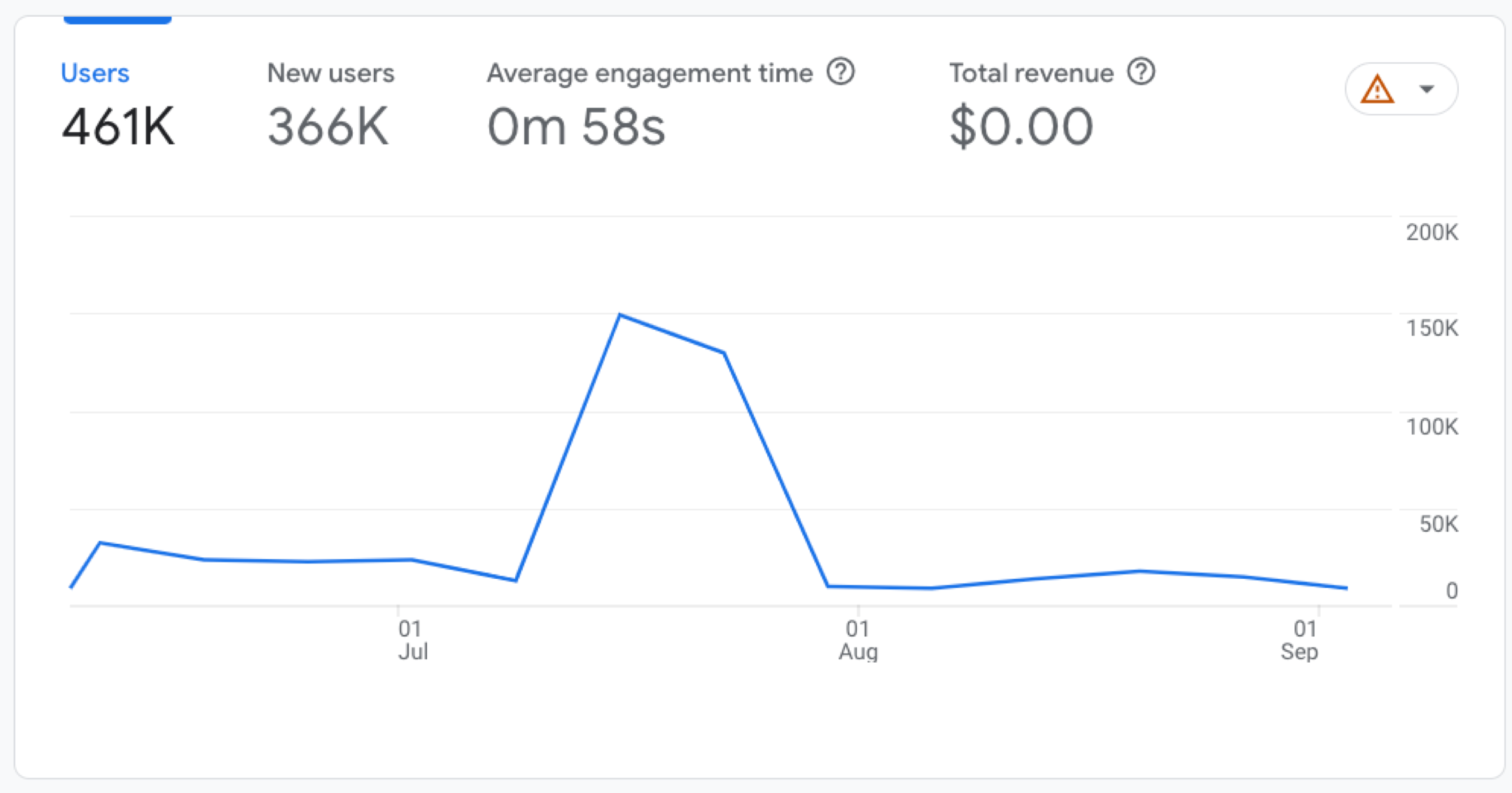
Anytime you see anomalies, ALWAYS, figure out WHY. You can see GA4 also highlighted these anomalies (the circles on the plot).
If we look at the 90 day view we can see a huge 2 week spike in users:
I dug deeper into this data and noticed that other sites besides the marketing site (e.g., the app) were sending data to this property. Essentially, someone had re-used the GTM code for the marketing website (including tags) and placed it in our app. ![]()
If we filter out the incorrect sites, we can see the real data which doesn’t look as good:
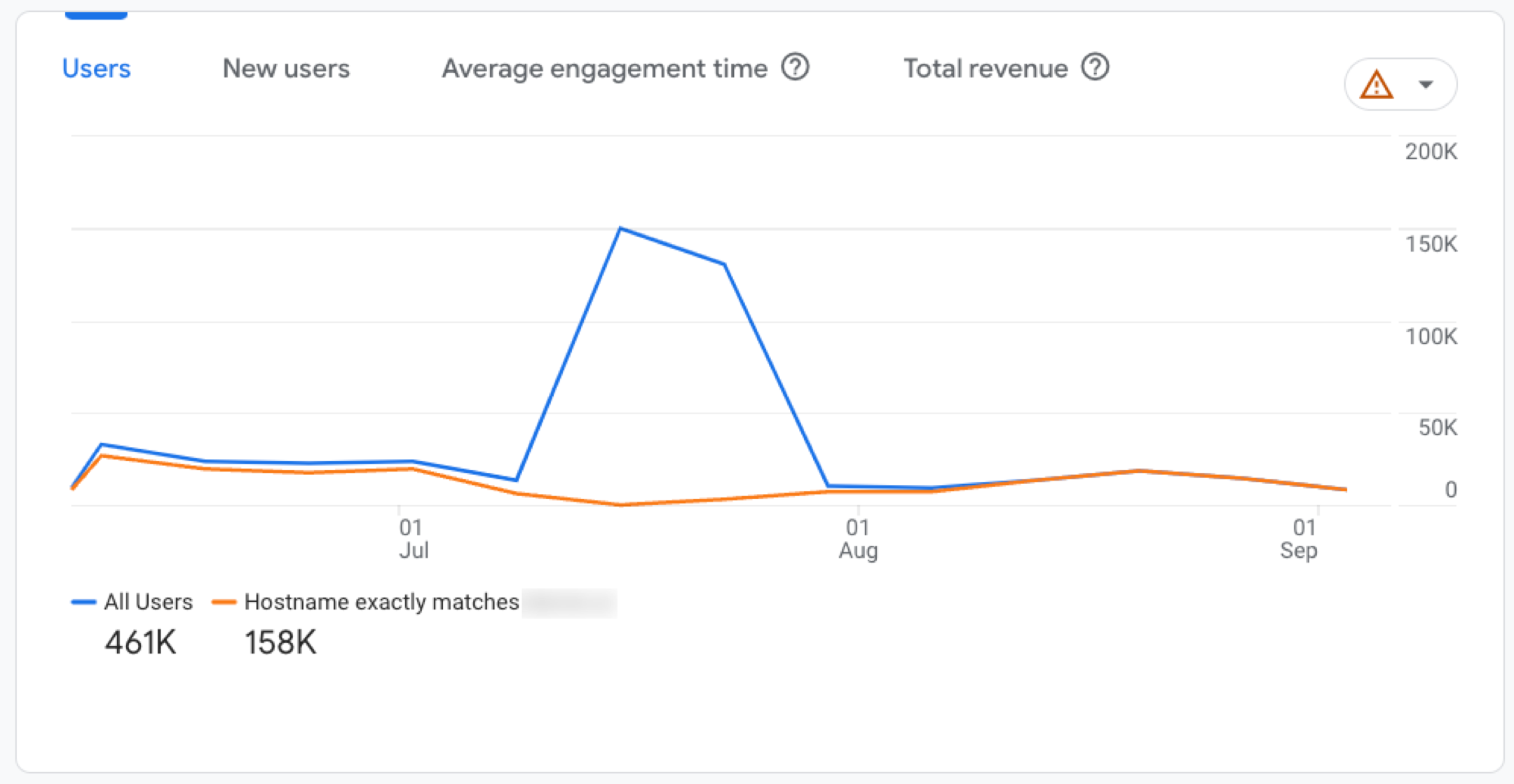
At first glance people during the spike would be like “this is great”, but the devil is in the details. If you didn’t drill into the data and the bad data continued to proliferate, you could actually be getting worse when you think you’re doing amazing.
I’ll repeat, anytime you see an anomaly, always drill down and figure out why. This will not only be a good indicator of a good campaign or social which should be doubled down on, but will also ensure you’re looking at clean data.
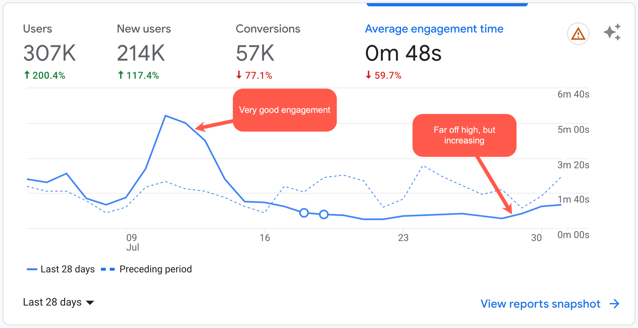
Example 3: Not looking at different time periods
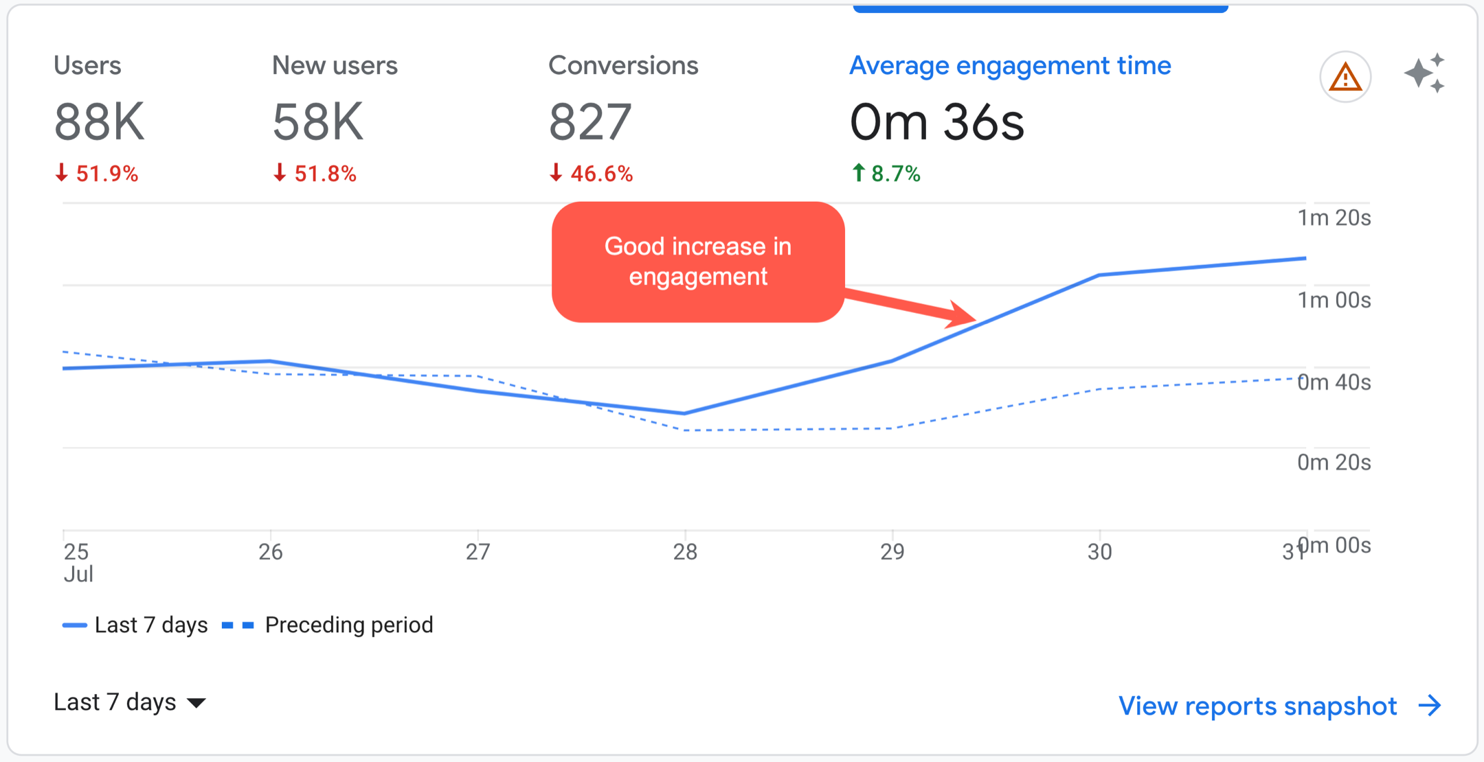
If we look at the following graph, upon first glance things look pretty good; engagement is increasing:
However, if we compare this 7 day chart to the 28 day chart, it doesn’t look as good, or does it?
If we zoom out to the 90 day, it is clear that we are not trending the right way, or is it?
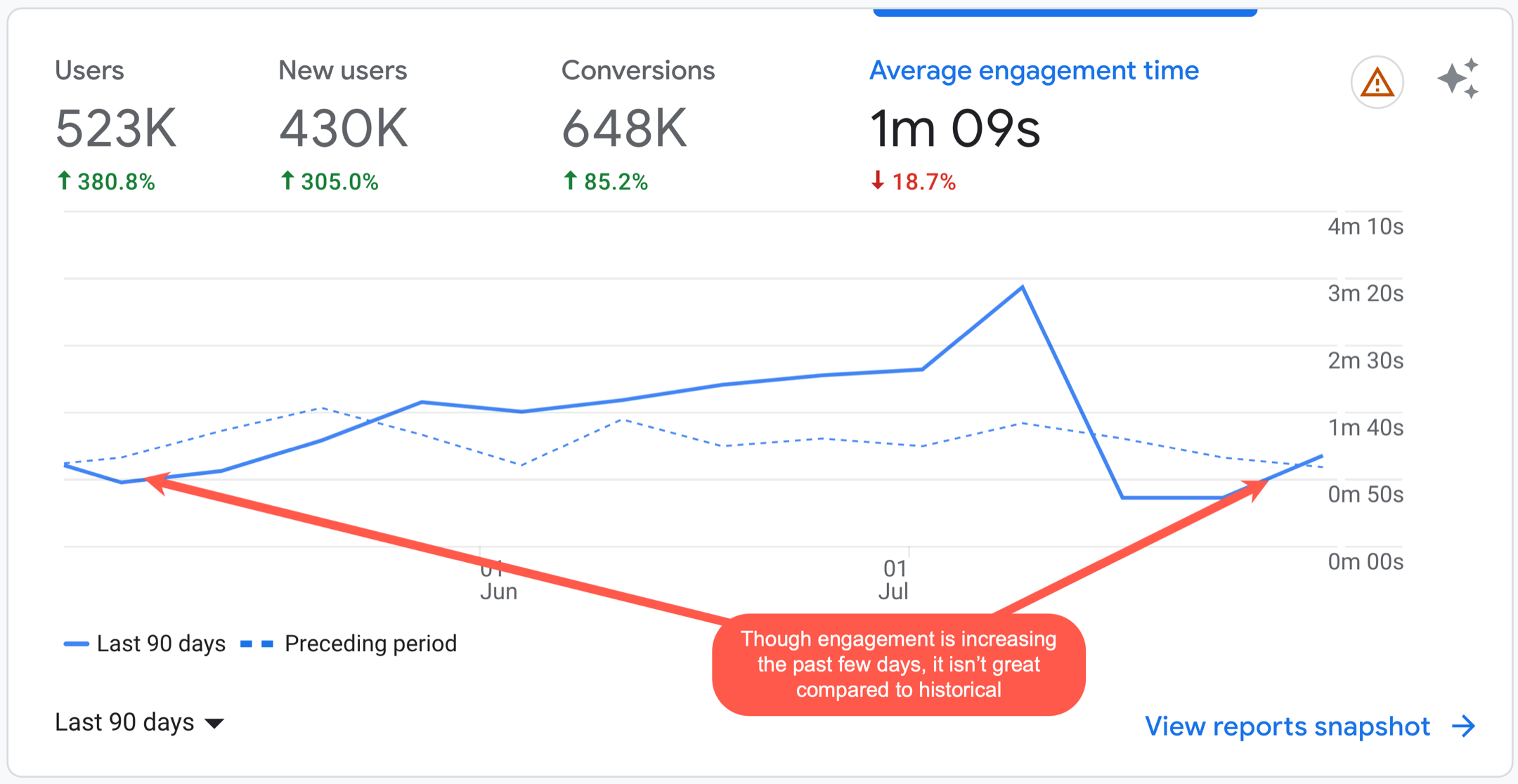
A common problem is people don’t look at how things are trending at different levels of granularity. A daily increase is great, however, if the quarterly is still trending down, there’s a problem that needs to get fixed.
A good way to help identify these things without requiring chart analysis, is using metrics that calculate rolling comparisons [Day, Week, Month, Quarter, Year]. This will help highlight when things are moving the wrong way.
NOTE: There is also a cyclical nature to some items which may impact trends.
Example 4: The need to slice and dice engagement
Social engagement is all the buzz nowadays with social media and can be a very beneficial medium when done right. When we look at the commonly used metrics for measuring social performance, we commonly see the following:
- impressions
- click-through rate (CTR)
- reaction rate
- share rate
- comment rate
- and many others…
These are very valuable metrics to measure how your content (essentially an ad or offer) is responded to. However, commonly people become ingrained in an “echo chamber” where “friendlies” aka employees, partners, family members or supporters are the primary people engaging on the content. While customer engagement is key, one of the core focuses is to attract new prospects.
Again, dive into the data and filter
To ensure you’re looking at non-biased data, it’s important to sift through the data and break it down into cohorts to see what the real engagement is with your target segments. It’s also very important to see what social platforms work for different segments as well as post types (e.g., a fluffy marketing post on Reddit would get destroyed).
For example, whenever I post a post like this on a social platform like LinkedIn, it will get some reactions, shares and comments. For this one, the engagement was great with 384 reactions, 27 comments, and 7 reposts.
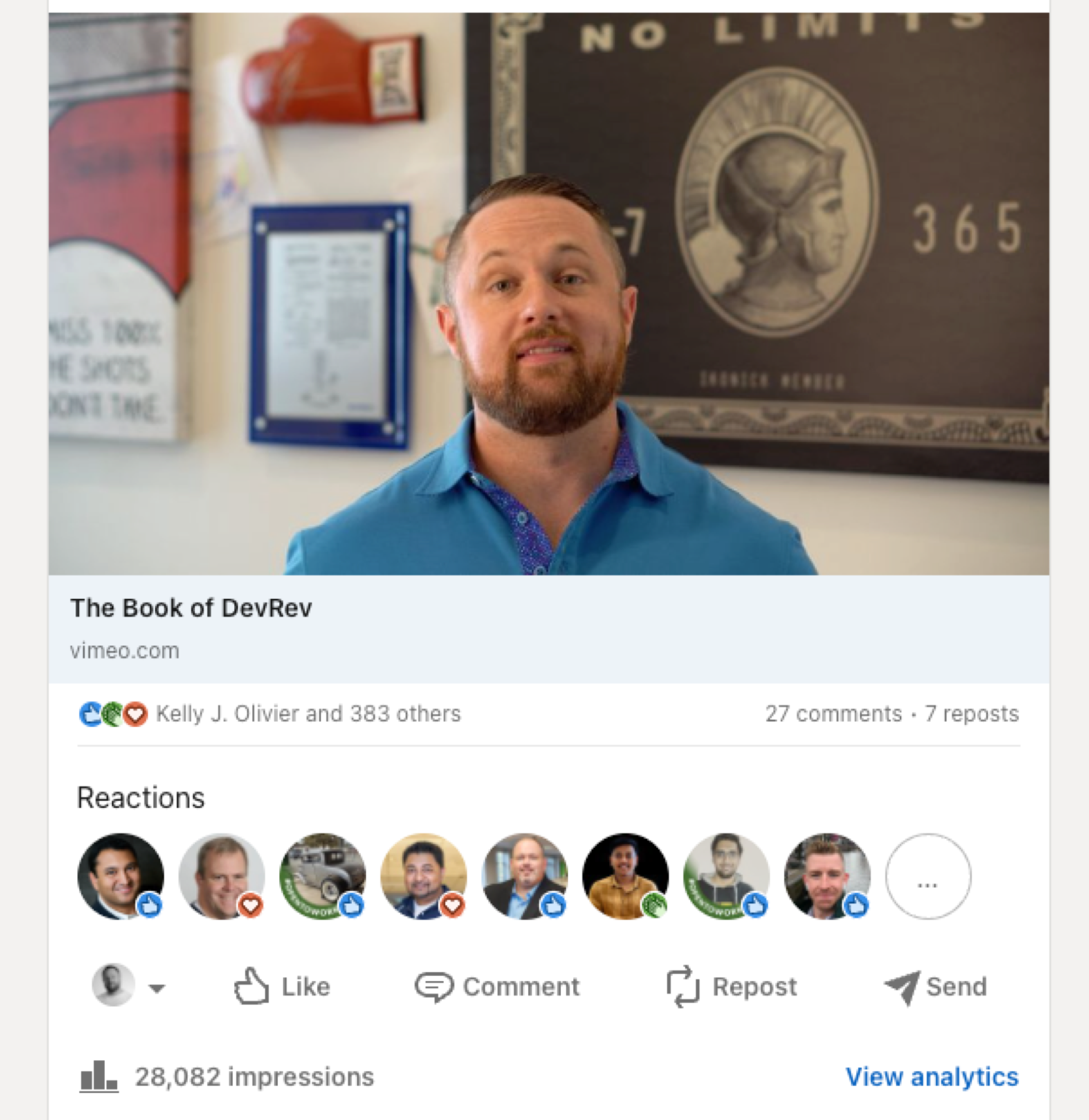
However, of the 384 reactions, 42 were from DevRev employees, so as far as reactions that matter, less than 342 were relevant to my target audience. Still great engagement, but don’t be fooled by hero numbers, always sift through the data!
If we look at another post that was more targeted at DevRev prospects, we can see the following:

Obviously it was a much smaller target so engagement wasn’t close to the previous example. However, of the 22 reactions, 5 of those were from DevRev employees and the majority of the remaining we’re actually targets but rather “friendlies”.
In short, the engagement in that post was really bad. However, if I didn’t filter through the engagement I would have thought things are great. I commonly see some posts with “great engagment”, however, upon review it was clear that all of the engagement from friendlies, that isn’t good!
What can impact engagement?
Obviously a lot of things can impact engagement, timing, channel, luck, images, keywords, etc. It’s important to run tests and then analyze the results and see what channels, times, keywords, graphics and styles attract the correct segments. NOTE: these will vary by region and industry. For example, I find great engagement on LinkedIn when I post when APAC is still awake, when I post later in the day I see a huge drop off as most engagement comes not from the US but rather APAC.
Stay Tuned
I’ll follow this post up with another focusing on key metrics to track! Stay tuned.